

A Year Later
- Kiza Azurin

- May 20, 2021
- 14 min read
Updated: May 20, 2021
School in quarantine has its own ups and downs, but it wasn't the worst. I still have things I'm happy for, things I'm proud of.
May 20, 2021
Welcome to a long overdue blog post! It is graduating year and might as well have a little party for all those small achievements.
Performance tasks
They compose majority of our grades per subject and are application tasks of our lessons. Most of them make sense, and some don't, but it doesn't matter which one they are; if we don't like it, we don't like it. Some annoying, some fun, some take too much time, and some drive you mad. Only one thing is for sure, they're memorable, for good reasons or bad.
Here are some of mine. Top "5" supposedly, but I don't think I know how to pick favorites.
The chief enemy of creativity is "good" sense; Pablo Picasso
Some of my favorites are the ones I have the most fun doing, even if fun is relative. Fun could be doing something old that I love, or doing something new that I could love. Either way, some stuff you just love and when you look back, you can smile despite the pain or hardship or whatever horrible thing you encountered. You might not even want to do it ever again, but at least it was a good memory, right? Or sometimes you might want to do it again . . . for whatever reason.
Favorite Five: Aesthetically pleasing edition
Collages, in general


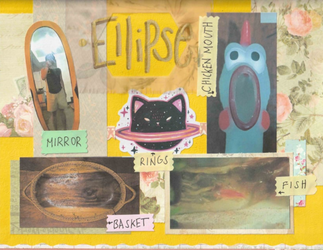


Pre-calculus 2020; PT Collage Album
I remember rushing this one before it was due midnight. It was a Friday and I had only started collaging after dinner because I still had to print and cut the pictures. Our task was a group work with six pages of collage on short folder. We all contributed pictures and my groupmate did the other two -- the circle collage and the second series & sequence collage. Had to pull out my plastic bag of paper scraps for this one and used my design borders for the first time. It was fun. My glue was choking near the end, but yeah, fun.
The funny part was I managed to finish at around 11:30 and I was freezing at the kitchen table. Then I find out that the due date was moved to Monday. Bruh moment. Smile and thank the Lord that it's done rather than having to spend your weekend on it.
***

IPHP 2021; Instagram-a-life
This is, per the PT, my life represented by a selfie collage that I sort of turned into a mood board. Well, honestly, the template I used was for a mood board. I won't go into the details of the collage that I had placed in the essay it came with. Lastly, all these pictures were taken within the past year, mostly between the start of school and I think a few days before this PT was due. I had to rummage the others from chats and Google Photos (not a sponsor).
Mood Board, not in general

Larang 2020; CPT Mood Board
I remember having issues with this one, having to do a course related mood board.
I always had issues on what course I want because I have two number ones. Though, my number one for STEM isn't available to me. I always go to my number two: Bachelor of Science in Medical Laboratory Science, still known as MedTech
Doing collages take a long time, especially this one. It's huge at 12"x24". Not as big as the ones we did in JHS which were cartolinas, but this one definitely has more than twice the effort we have those.
Was I really going to use my good materials for this? This thing of a panful reminder of the aches of college. This thing. Yes, I did. I used my nice design paper, did the high quality printing on board paper, spent a lot of glue, and even pulled out the washi tape. My pictures look filtered, but they don't actually have filters. I printed them on orange specialty board. I can be dramatic, alright? But it's hard to walk away from things I love, and that is creating.
Kaartehan. This thing took me the whole afternoon and I didn't sleep until it was done which was maybe at 11 or 12 pm. I mean I could have just printed the labels for the stuff I put on there, but no. I pulled out the heart-shaped can and rummaged through hundreds of die-cut letters just for the scrapbook aesthetic.
Scanning this was hell. It was night and I was making a ruckus with the printer just to scan, so I scanned the next day instead. First off, my scanner fits a size slightly bigger than A4, so this doesn't fit. Second, I had to scan it in sections and didn't want to push down on the sides so much to avoid creases. I got a displeasing shadow instead. Lastly, piecing the scanned images back together on my editor was awful.
*
That's that, but there were also funny things about it.
My handwritten definitions were such a let down compared to everything else. I'm still proud of my handwriting even if does make me cringe.
I saw those cute blood cells on Pinterest and just had to add them. We have the white blood cells (leukocytes) : basophil, eosinophil, monocyte, neutrophil, and lymphocytes. Then there is also the red blood cells (erythrocytes). I went and looked for a nice microscope too, just for the fun of it.
I hated what it reminded me of, but I kept it anyway, like the rest of my "beautiful" works. Took a discarded slider, a bit of newspaper, some yarn and hung it on the wall. It used to be on the right of the window where my desk used to be. When I moved to a room with my desk and everything, I moved the board to the left of the window adjacent the aquarium. When I exit my room and look slightly to the left, it's there, and I don't plan to throw it out soon.
Larang was in my top 3 of most annoying subjects for many reasons and most of it was certainly not enjoyable. It's school and it wasn't exactly made to be fun. This though, I had fun with for most parts.
A last note, I know I complained about all the material and physical working stuffs and still went with it. We were actually given the option to do digital, but I wasn't feeling the space right enough. Plus, pain and all, the physical was more fun.
Brochures, in general


EAPP 2020; CPT Resume Brochure
This me putting a work about a compilation of works into a compilation of works. I don't really have much to share about this other than I micromanaged doing it. As in even after saving the file I would check it again and sometimes keep editing then download the file again and replace the old one. It's something I do to all of the things I edit and I don't think it's going away.
Feel free to read the things I have on my brochure. Come on, don't just look at it. One of the things I have there is the food review which we also made a power point presentation of for the documentation and I'll also be sharing that later.
Lastly, I'd like to direct you to the lower right side of the second image, in the know more section. You can search me or poke around this site because I also have my contact info here. Go ahead and check me out, particularly my works which you can view on my Instagram. I have most of my paintings and drawings on there.
***


CPAR 2021, Art and Artists of Your Region
This is my favorite brochure that I have ever made and also the first time I submitted a draft.
That's a draft?
Yes, it is. Let me explain.
I use Canva (not a sponsor) for nearly all of my digital work and I have been using it since I was in ninth grade. It has come a long way since and now you can make GIFs, videos, and power points. Anyway, it has a free and premium version called Canva Pro.

The premium version has full access to all templates, elements, texts, etc of all the tools available. I use the free version so any item I am able to add and have not purchased will have the Canva watermark. The good thing is that you can still download your design even with unpaid premium items, but will have all the watermarks. It's called a watermarked draft, and it's free. Less pleasing to the eyes, but entirely free. Sometimes, you want the perfect elements, which are sometimes not free.


<--Here it is bare. I removed the text and images from the finished product.
So yeah. The template I used has the flowers as premium items. I blurred them a bit because they worked in the background better that way and it also helps make the watermark less noticeable. I also had to align the other items above the flowers just right so that the Canva in the middle of the item won't show.
I really loved the template and I also love the color orange. The original template and finished product look very different, but I'm proud to have utilized the elements I started with and how it inspired me. I hope you can take time to read this brochure as well.
I'm the Canva pro who can't afford Canva Pro
Presentations, in general

EAPP 2020; Food Review Documentation
This is the one I mentioned earlier and it was originally a power point when I passed it but I turned it into a GIF for the blog. I also made this on Canva (still not a sponsor) with a scrapbook style template for presentations. I love making my own GIFs on Canva. It shows the process of how we cook nilagang manok. I like a sort of vintage vibe and scrapbook style with a bit of mood board essence if you have noticed.
This one took me a while to do because I kept forgetting to take pictures when we had this for ulam. The pictures I used were taken from three different times we cooked it. Nilagang manok also means a lot to me so that's why I picked this dish.
Sindad na manok lng naman, pero may Knorr at laygu
***
MIL 2021; Snapshot Slideshow
Ten snapshots around the city about observable issues. I wish I could have taken better photos for this one, but Google street view isn't exactly dynamic. Out of all the pictures I used, only four were the ones I took personally.
I wasn't really confident with how I captioned a few of them but others I'm really happy with. My uncle (who is actually younger than me by a year, but we're in the same batch) was here when I was doing this PT. He helped me think of the last issue I needed to complete the ten and also helped with some of the captions.


The captions I really like are NSFW (not safe for walking) which I thought of
and the one my uncle thought of that I like the most is Spaghetti Disco.

He also thought that the Stairway to Heaven was really funny. It's fits the picture, I guess, but should it really be a laughing matter?
Thanks again to Google Maps Street View for helping me on this (not a sponsor).
***
This is the only video I am able to post, but I am proud of most of the videos I made this year. Some of them I find cringy in the slightest, but I love them all the same. I made a folder for my other videos and you can follow this link and watch them.
I have:
spoken word poetry A Voice, 2020; 21st Century Literature
video analysis on Requim by Ana Akmatova & A Convict's Twilight by Arturo Rotor, 2020; 21st Century Literature
a vlog about rocks (I think) Vlog It! Rocks, 2020; Earth Science
a clip from Hacksaw Ridge (one of my fave movies. It's just a video I edited for a small group activity and the original material is not mine but I wanted to still share it to you. Hacksaw Ridge Clip, 2021; Immersion
Painting, not in general

CPAR 2021; No Title, literally. It's a random still life.
This was for PT1 that I refused to do on oslo paper. Well, I didn't have oslo paper at home either. All I had close was either bond paper or board paper both in either letter or folio and two canvas panels that were 8"x10". Of course I went with the panel.
Compared to the other kinds of paintings, I was almost always a still life painter in realism or impressionism styles--mostly realism. I have been painting with oil and mixed media for about three years. Perhaps I could actually name this one Breakthrough. The original image is not mine so I sort of feel like I can't name a painting that was made after it.


Why I could refer to it as Breakthrough is a personal story, but I'll give the gist.

I have been struggling with my art and going through mental issues with it and this is the first time I paint, and I mean really paint, after a year. The last painting I made was done last year and it is a slight let down from this one. I guess I broke through all my issues enough to have enjoyed this one. It has been a while since I gave so much heart. Not that I put a lot of heart in everything else, but this is the one that really hurts in the heart bits.
A little about this painting here on the left. It is oil and acrylic on A4 acrylic acid-free paper made in April 20202. I hated this thing, I still kinda do. The flower looks awful and been wanting to repair it for a while but I unfortunately ran out of fixative spray and don't have the budget to get a new can. It can wait for a long time.
I haven't really painted a lot in the three years that I have been practicing and I think sharing one is enough. I know I shared my all my previous paintings somewhere around here. You can poke around the site and look for them if you like.


Going back to Breakthrough, it was a mess. They say that oil is unforgiving but I cannot even count the mistakes on that painting that I tried to erase.
It's still an awesome painting that I did in my own liking, not exactly with the reference. I don't think I'm that much of a realist though even if it's so tempting to try and copy details to the point. But yeah, it was a grand time. I have it hung in a clearbook sheet stuck to the wall by push pins on the kitchen wall.
I just really like coffee. It wasn't my first choice of reference photo. It wasn't even in the top three. There were two I was looking at that I had previously chosen but then I decided to keep searching because I didn't want to do something that looked a bit monochrome because it had a lot of wood in it.
I first took the reference photo and put it in Canva (not a sponsor) in a design that is the same size as the canvas panel, 8"x10", to properly crop it. Then I printed it on a letter bond paper and used tracing paper for the major lines. Traced again on the canvas then did blocking with some sort of gray I think . . . I don't have pictures for the process because the ones I did have I took with Messenger's story feature (not a sponsor) and uploaded directly. I remember doing three stories: one for the blocking, after a few layers, and when the berries on the pastry were the only ones not painted yet. Then I posted my painting to Facebook (not a sponsor) along with these three -->
I finished Breakthrough on April 21 and had a hard time taking pictures.
Here are the other options I gathered and I might do them someday, who knows. These images are not mine because I got them all from Pinterest (not a sponsor).


I really like coffee
Honorable mentions, in general
I probably did 50/50 between Canva (not a sponsor) and Microsoft Word (not a sponsor) for all school work.
***
IPHP/Philo (Philosophy)


These two were for IPHP (Philosophy). The left one is a self-made quote about the inevitability of death and the right one are quotes from people who have influenced me as a human person with some essay bits. It originally had purple background so it would be easy to remove the purple in Gimp that I learned in eleventh grade.
***
PR3 & IMRSN (Immersion)


Immersion wasn't fun. In fact, it was in tie for the second most annoying subject this second semester, in my opinion, but it was definitely easier than PR3--I'm sure. Oh, the stressful defenses.
She really likes slide? All we ever did was either in a word document or on a ppt slide. The first one is a sort of summary of the results of our study last semester. Now that, that was fun. Extremely stressful, but fun. The second one is another scrapbook style I did earlier this semester in our topics about leadership. It was for a blog post in Genyo and I could have just did the text and image paste . . . but I really like doing stuff on Canva (not a sponsor) and she said be different so . . . Then the third one is a word cloud for the second quarter of this semester and it's about advocacy goals. Like a little prelim activity. I wanted it as a GIF from the start but shorter ones oddly have larger file sizes than the longer ones I made.
***
P6 (General Pysics 2)


These are our mobile project thingy 3D plans that we made last semester and it is hilarious. Trust me.
The one on top is The Torque-Powered Charger (TPC), the plan for my group's project. The one on the bottom is The Dustinator --it's a horrible name, I know, but it was the best option-- and it's the plan for my friend's group project. The funny part is that I designed the TPC, but I wasn't the one who drew the plan. I had my groupmate draw it to split the work. Then my friend designed the Dustinator --cringe-- but I was the one who drew it because it was a favor, I had extra time, I had cartolina lying around, and I didn't want to stress myself out trying to teach this guy how to do isometric drawings over chat. Isometric drawing in eighth grade got complicated enough on it's own, it would be worse trying to explain it to someone who needed it right away and never had experience or even an idea about it. Plus, I had fun anyway. He basically just sent me the design and I asked him to write a few labels and it was golden. The scanning process wasn't as annoying as my mood board because I could fold the cartolina. As usual though, putting it back together in editing was a pain, the cleaning was less a pain.
This second semester, we went on to building our prototypes and finishing the whole thing in the second quarter. I built the entire prototype that my groupmate finished for the final. I didn't take proper pictures before I passed it on to him for finishing so this slideshow will contain the pictures he took. These were also the ones we submitted for our photo documentation PT.
PS. I edited the labels for the photos though.
Because I tweaked the design a bit in the building process.
Unfortunately, the photo orientations aren't unified.

I'm proud to say that the materials I used for the prototype were all recycled other than the wooden stir sticks and tape, because well, you can't really recycle tape now, can you? I was also lucky to have recently gotten a desktop that time and decided to keep the packaging materials of the parts. particularly, the plastic case of the fan was very useful and it had a cool design that I managed to make functional. Our model most likely won't work because we used the wrong magnets but I'm still proud that I designed and still manage to improve our prototype. Yep, no magic like something you can mostly disassemble that is made of illustration board and stir sticks. I also used up a lot of glue.
A Parting Note
PTs are hard. Written works are hard too but PTs take a lot more time and so much willpower. Sometimes you just want to stop working but you can't. All I know is that having a playlist I don't get sick of helps so much for a lot of things, and coffee. Not because it's caffeine, but because it makes me happy.
I really like coffee . . . and Taylor Swift . . . also country, but mostly Taylor Swift
Well, I know I sort of cheated the Favorite Five thing by doing works by kind and not just one work is one work. I just really wanted to share a lot with you and I hope you'll come back when I do part two of two which will cover Favorite Five: Literary Edition. That's all for this post. Thanks for reading and see you next time.

Comments